Responsive Tours
The tours you create with MapsAlive are responsive. Responsive means that the tour's dimensions automatically adjust to make the tour look its best on whatever device it is displayed on: desktop, tablet, or phone.
Desktop Browsers
As you make a desktop browser narrower, a tour becomes narrower as shown in the sequence of three screenshots that follow.
As the browser narrows, a Classic tour's aspect ratio (the tour's shape as a ratio of its width to its height) is preserved whereas a Flex Map tour's shape automatically adjusts to best fit the available screen space.
Classic tour using a tiled page layout
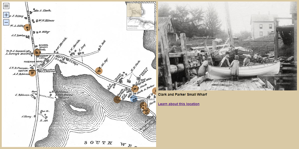
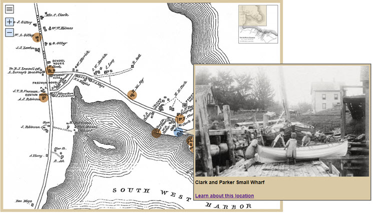
The screenshots below show how a standalone Classic tour using a tiled page layout displays at its full width when the browser is wide enough and gets narrower as the browser gets narrower.
Wide browser
The tour below is about twice as wide as it is tall, a 2:1 aspect ratio. Because it's a Classic tour, its width is fixed which prevents it from getting wider than the tour size, even if the browser is very wide.
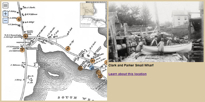
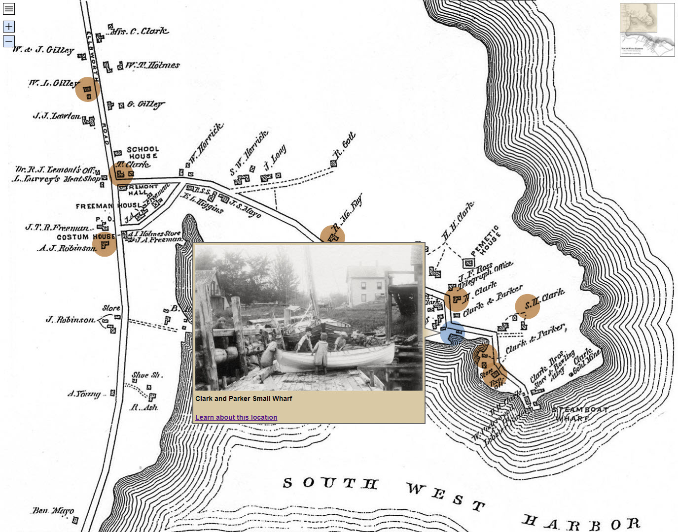
Narrower browser
When the browser gets narrower, the tour becomes narrower and shorter to preserve its aspect ratio, and of course the map, image, and text area get proportionally smaller.
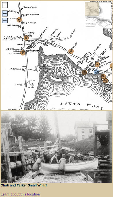
Very narrow browser
When the browser becomes so narrow that the map, image, and text would be squished, the tour automatically switches to a stacked layout where the map, image, and text are in a column. The stacked layout allows the map, image, and text to be larger than in the original layout.
How to prevent a tour from switching to stacked layout when the browser is narrow
Use the API's setTourSetting function to set the stacked-layout setting as shown below. You can place the code in the JavaScript field of the Custom HTML screen.
function onEventPageLoaded(event) {
   event.api.setTourSetting("stacked-layout",0);
}
How to control when a tour switches to stacked layout
See the documentation for the stacked-layout tour setting.
Classic tour using popups
Below is the same tour as above, but it uses a popup layout instead of a tiled layout. The tour is not as wide as the version that uses the tiled layout, yet its map is bigger. However, because it's a Classic tour, even when the browser is very wide, the tour can become no wider than the tour size.
Flex Map
The screenshot below shows the same tour converted to a Flex Map. It uses all of the available browser area, regardless of the tour size.
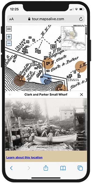
Mobile Browsers
The same tour is shown below on a small mobile device. The mobile appearance is the same no matter if the tour is a Flex Map tour, or a Classic tour using either popups or a tiled layout.